

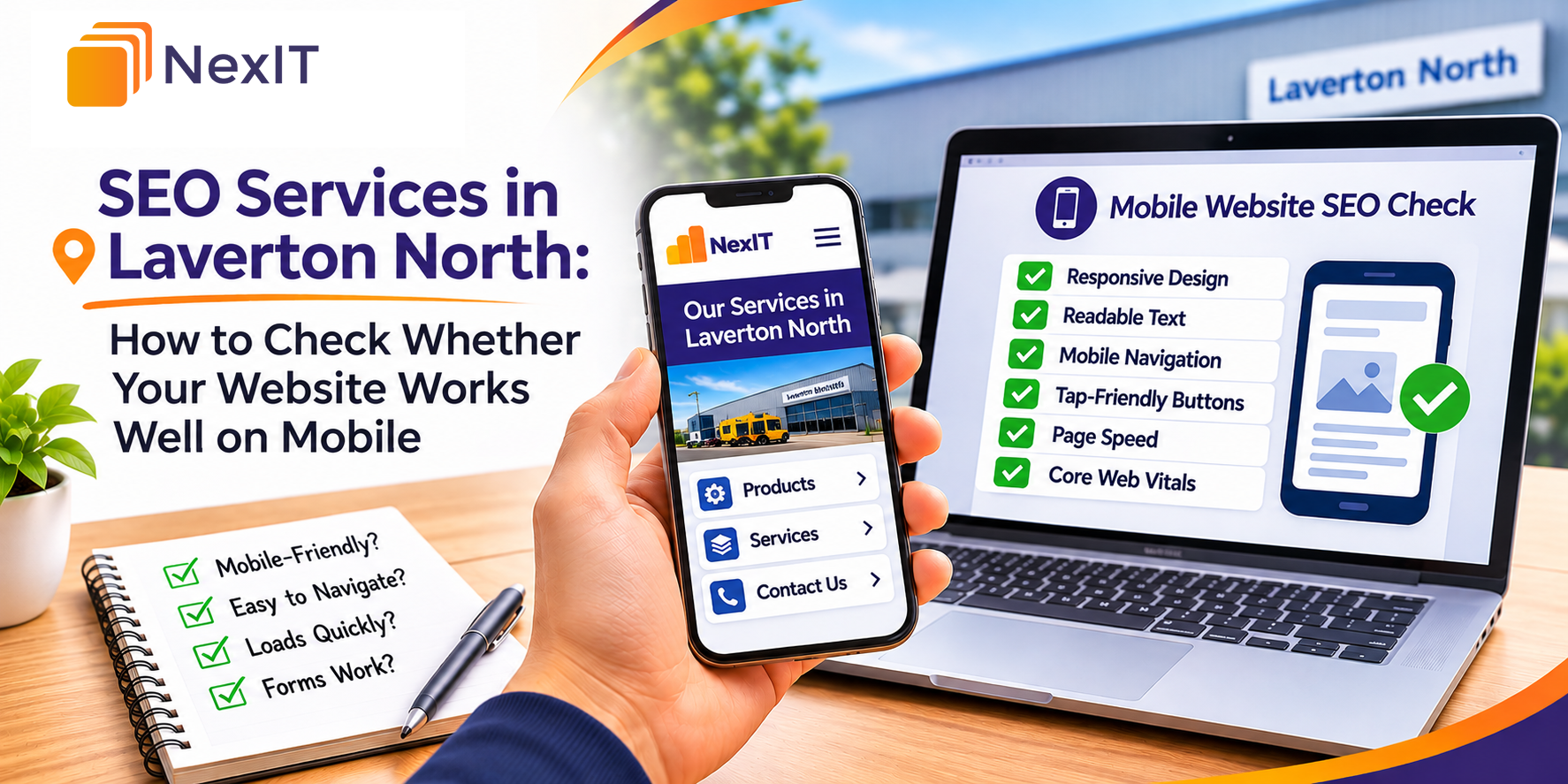
SEO services in Laverton North can help businesses review how their websites perform for customers using smartphones and other mobile devices. A mobile-friendly website should make it easy for visitors to read information, navigate between pages, compare services and contact a business without unnecessary difficulty.
Customers searching for industrial suppliers, transport companies, equipment services or local contractors may visit a website while travelling, working onsite or comparing providers. If the website is difficult to use on a mobile device, visitors may struggle to find the information they need.
If you’re reviewing your website with NexIT Solutions, start with the pages that matter most to your business. These may include your homepage, service pages, product categories and contact page. Check how these pages appear on a smartphone and whether customers can complete important actions.
Why Should You Check Whether Your Website Works Well on Mobile?
A website may look organised on a desktop computer but display differently on a smartphone. Smaller screens can reveal problems with text size, navigation menus, images, buttons and page layouts.
Google primarily uses the mobile version of a website’s content for indexing. This makes it important to ensure that mobile visitors and search engines can access the main content and important links.
A mobile website review should focus on usability, content accessibility and technical performance rather than appearance alone.
A Detailed Mobile Website Review Can Help You
- Identify pages that are difficult to read on smaller screens.
• Check whether navigation menus work correctly.
• Find buttons and links that are difficult to select.
• Review page loading performance on mobile connections.
• Confirm that important content appears on mobile devices.
• Identify images or tables that extend beyond the screen.
• Test contact forms, enquiry buttons and phone links.
• Improve the experience for customers visiting from mobile search.
1. Which Website Pages Should You Check First?
Start with the pages that customers are most likely to visit or use when making an enquiry.
A business website may contain many pages, but some have a greater role in helping visitors understand services, compare products or contact the company.
Review the most important pages before expanding the assessment to the rest of the website.
Pages to Include in Your Mobile Review
- Homepage and main navigation.
• Important service pages.
• Product category pages.
• Individual product pages.
• Location-specific landing pages.
• Contact and enquiry pages.
• Frequently asked questions.
• Blog articles receiving search traffic.
• Quote request or booking pages.
• Other pages linked from the main menu.
For example, a Laverton North industrial supplier may receive enquiries through its product category pages. Checking these pages on mobile can help identify whether customers can view specifications and request quotes without difficulty.
2. Does Your Website Fit Different Mobile Screen Sizes?
A responsive website adjusts its layout to different screen sizes. Text, images, navigation and page sections should remain usable when the available screen width changes.
Open the website on a smartphone and check whether the content fits within the screen.
Avoid reviewing only one device size because visitors may use phones with different screen dimensions.
Mobile Layout Details to Check
- Page content fits within the screen width.
• Visitors do not need to scroll horizontally to read normal content.
• Images resize without becoming distorted.
• Headings remain readable.
• Text columns are not excessively narrow.
• Buttons fit within the available space.
• Tables remain accessible on smaller screens.
• Page sections appear in a logical order.
• Important content is not hidden or cut off.
For example, a service page may display three columns on desktop but arrange them vertically on mobile.
Check that the mobile layout presents the information in a sensible order and keeps the main enquiry option accessible.
3. Is the Text Easy to Read on a Smartphone?
Mobile visitors should be able to read website content without repeatedly zooming in.
Small text, long paragraphs and poor colour contrast can make information difficult to understand.
Review how headings, paragraphs, links and supporting details appear on mobile devices.
Text Readability Checks to Complete
- Body text is comfortable to read.
• Headings are clearly distinguishable from paragraphs.
• Text does not overlap with images or buttons.
• Paragraphs are divided into manageable sections.
• Line spacing supports readability.
• Text colours provide sufficient contrast.
• Important information is not presented only inside images.
• Links are visually identifiable.
• Font sizes remain consistent across similar pages.
For example, a transport company in Laverton North may have a service page describing freight options, delivery areas and enquiry requirements.
Breaking the information into clear headings and shorter sections can help mobile visitors find relevant details more easily.
4. Can Visitors Use the Mobile Navigation Menu?
Website navigation helps visitors move between important pages.
On mobile devices, desktop navigation menus are often replaced with a menu icon or expandable navigation panel.
Check whether the mobile menu opens correctly and provides access to the pages customers need.
Mobile Navigation Checks to Complete
- The menu icon is easy to identify.
• The menu opens and closes correctly.
• Navigation links are readable.
• Important service pages are accessible.
• Submenus expand without difficulty.
• Links are not positioned too close together.
• The menu does not cover essential content unexpectedly.
• Visitors can return to the homepage.
• The navigation works after changing screen orientation.
For example, an industrial equipment supplier may organise products into several categories.
A clear mobile menu can help customers move from the main product range to a relevant category without opening multiple unrelated pages.
5. Are Buttons and Links Easy to Tap?
Mobile visitors interact with websites using their fingers rather than a mouse pointer.
Buttons and links that are too small or positioned too close together may be difficult to select accurately.
Review the interactive elements on important website pages.
Tap Target Details to Review
- Buttons are large enough to select comfortably.
• Links have suitable spacing.
• Contact buttons are easy to identify.
• Navigation links do not overlap.
• Form controls can be selected without difficulty.
• Product cards link to the correct pages.
• Expandable sections open when selected.
• Important actions do not depend on mouse hover.
• Buttons remain usable when the page is zoomed.
For example, a website may display a phone number and email link next to each other.
If the links are too close, visitors may accidentally open the wrong contact option.
Adjusting the spacing can make the page easier to use.
6. How Quickly Does Your Website Load on Mobile?
Mobile loading performance can influence how easily visitors access website content.
Large images, unnecessary scripts, third-party widgets and inefficient page resources may affect loading speed.
Use a performance testing tool to identify issues and review how quickly important page content becomes available.
Google PageSpeed Insights provides mobile and desktop performance information, including Core Web Vitals where sufficient real-user data is available.
Mobile Performance Details to Check
- How quickly the main content becomes visible.
• Whether large images delay page loading.
• Whether unnecessary scripts affect performance.
• Whether the page responds promptly to interactions.
• Whether page elements move unexpectedly while loading.
• Whether caching and compression are configured appropriately.
• Whether third-party widgets affect performance.
• Whether the page performs consistently across important templates.
For example, a Laverton North business may use a large banner image on its homepage.
If the image is unnecessarily large, it may increase the amount of data mobile visitors need to download.
Optimising the image can help reduce page weight while maintaining suitable visual quality.
7. What Do Core Web Vitals Tell You About Mobile Performance?
Core Web Vitals are metrics used to evaluate important aspects of the user experience.
They focus on loading performance, responsiveness and visual stability.
Review these metrics alongside practical testing because a performance score alone does not explain every usability problem.
Core Web Vitals to Review
- Largest Contentful Paint (LCP) — Measures when the largest visible content element finishes rendering. A good result is 2.5 seconds or less.
- Interaction to Next Paint (INP) — Measures responsiveness to user interactions. A good result is 200 milliseconds or less.
- Cumulative Layout Shift (CLS) — Measures unexpected visual movement. A good result is 0.1 or less.
These thresholds are assessed at the 75th percentile of page visits when evaluating real-user performance.
Where to Check Core Web Vitals
- Google PageSpeed Insights.
• Google Search Console Core Web Vitals report.
• Chrome DevTools.
• Other suitable website performance monitoring tools.
For example, a page may load its heading quickly but move the enquiry button when an image appears.
This unexpected movement can affect visual stability and make the button difficult to select.
8. Do Images and Videos Display Correctly on Mobile?
Images and videos can help businesses explain their services, products and facilities.
However, media that is not properly configured may create layout problems or slow down mobile pages.
Check whether visual content remains useful on smaller screens.
Mobile Image and Video Checks
- Images fit within the screen width.
• Product images remain clear.
• Important details are not cropped unintentionally.
• Image dimensions are appropriate for the layout.
• Image files are reasonably optimised.
• Videos resize correctly.
• Video controls are usable on mobile.
• Media does not overlap with text.
• Important information remains available as readable text.
For example, a business may use a wide desktop banner showing industrial equipment.
On mobile, the same banner may crop important details because the available screen width is smaller.
Review the mobile display and consider whether a different image crop or layout is required.
9. Can Customers Complete Contact Forms on Mobile?
Contact forms are important for businesses that rely on enquiries, quotations or consultation requests.
A form may work correctly on desktop but become difficult to complete on a smartphone.
Test the entire form rather than checking only its appearance.
Mobile Contact Form Checks to Complete
- Form fields fit within the screen.
• Labels are readable and clearly associated with fields.
• Visitors can select each input easily.
• Appropriate mobile keyboards appear for phone and email fields.
• Required fields are clearly identified.
• Error messages are understandable.
• Dropdown menus work correctly.
• File upload options work where provided.
• The submit button remains accessible.
• A clear confirmation appears after successful submission.
For example, a Laverton North logistics company may provide a freight quotation form.
If visitors cannot select a delivery location or submit the form on mobile, the website may lose potential enquiries.
Complete a test submission and confirm that the form works as expected.
10. Are Phone Numbers and Contact Details Easy to Access?
Mobile visitors may want to contact a business directly after reviewing its services.
Make sure the website provides a clear route to the relevant contact information.
The appropriate contact options depend on the business and how customers usually make enquiries.
Contact Information to Review
- Business phone number.
• Click-to-call functionality.
• Email contact link.
• Contact form access.
• Business address, where relevant.
• Operating hours, where applicable.
• Directions or map links, where useful.
• Service area information.
• Quote request buttons.
• Contact details in the mobile footer.
For example, a customer searching for an industrial repair service in Laverton North may want to call the business immediately.
A visible phone link can help the visitor contact the company without manually copying the number.
Confirm that all contact details are accurate and consistent with the business’s other online information.
11. Is Important Website Content Available on Mobile?
Google primarily uses the mobile version of website content for indexing.
If important information appears on desktop but is missing from mobile, search engines and mobile visitors may not receive the same useful content.
Review the main information on both versions of important pages.
Mobile Content Checks to Complete
- The main heading appears on mobile.
• Important service descriptions remain available.
• Product specifications are accessible.
• Relevant images include appropriate alternative text.
• Internal links remain available.
• Structured data is consistent where applicable.
• Important content is not removed from the mobile version.
• Expandable content works correctly.
• Mobile pages provide the same essential information as desktop pages.
For example, an industrial supplier may display detailed product specifications on desktop but hide the specification table on mobile.
If customers need those details to compare products, the mobile page should provide an accessible way to review them.
12. Can Visitors Use Product Tables and Detailed Information?
Business websites sometimes contain specification tables, product comparisons, service lists and technical documents.
These elements can be difficult to display on smaller screens.
Review whether visitors can access the information without losing important details.
Technical Content Checks to Complete
- Specification tables remain readable.
• Horizontal scrolling is limited to the table where necessary.
• Important columns are not unintentionally hidden.
• Product comparison information is accessible.
• Download links work correctly.
• PDF documents can be opened.
• Table headings remain understandable.
• Technical diagrams can be viewed clearly.
• Visitors can identify the correct product or service.
For example, a Laverton North equipment supplier may display product dimensions, materials and load capacities in a table.
On mobile, the table may require its own horizontal scrolling area or an alternative layout.
The goal is to preserve useful information while making it easier to access.
13. How Can You Test Mobile Usability With Browser Tools?
Browser developer tools can help identify layout and responsiveness problems.
Chrome DevTools includes device emulation features that allow you to preview pages at different screen sizes.
However, browser emulation does not replace testing on actual smartphones.
Suggested Mobile Testing Process
- Open the website — Visit an important page in Google Chrome.
- Open developer tools — Use the browser’s developer tools to inspect the page.
- Enable device emulation — Select the device toolbar to preview a mobile viewport.
- Test different widths — Check how the layout responds to smaller and larger screens.
- Review navigation — Open menus and follow important links.
- Test interactive elements — Select buttons, forms and expandable sections.
- Check page content — Confirm that headings, images and tables display correctly.
- Review performance — Use appropriate performance tools to identify possible loading issues.
- Test a real smartphone — Confirm the findings using an actual mobile device.
- Record problems — Note the affected URLs and the changes required.
This process helps identify common mobile usability issues before they affect more visitors.
14. How Should You Review Mobile Search Performance?
Google Search Console can help businesses understand how their websites appear in mobile search results.
The Performance report allows you to review search data by device type.
Compare mobile and desktop performance to identify pages that may need further investigation.
Mobile Search Performance Details to Review
- Mobile search impressions.
• Mobile search clicks.
• Click-through rate.
• Average search position.
• Queries generating mobile traffic.
• Landing pages receiving mobile clicks.
• Changes after website updates.
• Differences between mobile and desktop search performance.
For example, a Laverton North service page may receive many mobile impressions but relatively few clicks.
Review its search queries, title and description to determine whether the search result clearly matches what customers are looking for.
If visitors reach the page but do not enquire, review the page experience and enquiry process using suitable analytics data.
Search Console performance data alone cannot confirm whether a mobile usability issue caused a change in traffic.
15. How Should You Monitor Mobile Performance After Making Changes?
Mobile website optimisation should include a follow-up review after changes are published.
Record what was updated and compare the website’s performance over suitable periods.
Avoid judging results from a single day because search traffic and user behaviour can vary.
What to Include in Your Follow-Up Record
- Page URL and update date.
• Mobile layout changes.
• Navigation improvements.
• Image optimisation changes.
• Form or button updates.
• Core Web Vitals results.
• Mobile search impressions and clicks.
• Mobile enquiry or conversion data, where tracked.
• Remaining usability issues.
• Date of the next review.
For example, a business may improve its mobile contact form and reduce the size of large images.
After publishing, the team can test the form again, review loading performance and monitor mobile enquiries.
This provides a clearer understanding of whether the changes improved the website experience.
A Practical Mobile Website SEO Review Table
| Review item | What to check |
| Important pages | Homepage, service pages, product pages and contact page |
| Responsive layout | Content adjusts correctly to different screen sizes |
| Text readability | Headings and paragraphs are easy to read |
| Mobile navigation | Menus and submenus work correctly |
| Buttons and links | Interactive elements are easy to select |
| Loading performance | Important content loads without unnecessary delays |
| Core Web Vitals | LCP, INP and CLS results |
| Images and videos | Media fits the screen and remains accessible |
| Contact forms | Fields, validation and submission work correctly |
| Contact information | Phone, email and enquiry options are accessible |
| Mobile content | Important information matches the desktop experience |
| Technical tables | Specifications and comparisons remain usable |
| Mobile indexing | Important content and links are accessible to Google |
| Search performance | Mobile impressions, clicks and queries |
| Follow-up | Changes and performance results are recorded |
Hypothetical Example: Reviewing a Laverton North Industrial Supplier’s Mobile Website
A Laverton North industrial supplier provides warehouse equipment, storage products and maintenance accessories.
The business receives website visits from customers using smartphones, but its team notices that some visitors struggle to browse product categories and submit enquiries.
The business decides to review its most important pages.
Before the Review
- The mobile navigation menu contains several difficult-to-select links.
• Product specification tables extend beyond the screen.
• Some product images are unnecessarily large.
• The enquiry form contains fields that are difficult to complete on mobile.
• The contact phone number is not easy to find.
• Important service pages have not been tested on different mobile screen sizes.
After the Review
- The navigation menu is reorganised to make important categories easier to reach.
• Product tables are adjusted to remain accessible on smaller screens.
• Images are optimised for appropriate display sizes.
• Form fields and buttons are improved for touchscreen use.
• A clear phone link is added to the mobile contact section.
• Important pages are tested on different smartphones.
• Mobile performance is reviewed using PageSpeed Insights and Search Console.
The updated website gives customers a clearer way to browse products, review specifications and contact the supplier from mobile devices.
The business can then monitor mobile search traffic and enquiries to evaluate the results.
Common Mistakes to Avoid
Checking Only the Homepage on Mobile
Review service pages, product categories, contact forms and other important pages. Different page templates may have different usability problems.
Assuming a Responsive Design Means Everything Works
A responsive layout does not automatically guarantee that menus, buttons, forms and other elements function correctly. Test the actual user experience.
Using Images That Are Too Large
Optimise images according to their display requirements. Unnecessarily large files can affect mobile loading performance.
Ignoring Text Readability
Check font sizes, spacing and contrast. Visitors should be able to read the content comfortably without repeated zooming.
Placing Buttons Too Close Together
Provide enough space around interactive elements to reduce accidental selections.
Hiding Important Content on Mobile
Keep essential service information, product specifications and internal links accessible to mobile visitors.
Testing Only With Browser Emulation
Use actual smartphones to confirm that navigation, forms and other features work correctly.
Focusing Only on PageSpeed Scores
Review real usability problems alongside performance metrics. A high performance score does not guarantee that the website is easy to use.
Forgetting to Test Contact Forms
Complete a test enquiry and confirm that the form submits successfully.
Failing to Review Results After Updates
Record changes and monitor relevant mobile performance and enquiry data over time.
A Practical Checklist Before Updating Your Website
- Open important website pages on a smartphone.
• Check the layout at different screen sizes.
• Confirm that text is readable without unnecessary zooming.
• Test mobile menus and internal navigation links.
• Review button sizes and spacing.
• Check image and video display.
• Test product tables and technical content.
• Complete a test contact form submission.
• Confirm that phone and email links work.
• Review mobile loading performance in PageSpeed Insights.
• Check Core Web Vitals where data is available.
• Confirm that important content remains accessible on mobile.
• Review mobile search performance in Google Search Console.
• Record changes and plan a follow-up review.
Discuss Your SEO Requirements With NexIT Solutions
If customers have difficulty navigating your website on smartphones, share your important page URLs with NexIT Solutions.
Include the pages you want to improve, the problems visitors experience and the actions customers should be able to complete.
For a Laverton North business, this may involve reviewing service pages, product information, mobile navigation and contact forms.
A clear review can help identify mobile usability issues and prioritise website improvements that support customer access and search visibility.
Book a Website Consultation →
Discuss mobile website usability, technical SEO and local SEO requirements with NexIT Solutions.